

If you’ve ever walked into a beautifully curated Japanese-inspired space and immediately felt calmer, there’s a good chance the colors had a lot to do with it. Traditional Japanese color palettes aren’t loud or attention-seeking—they’re soft, layered, and incredibly intentional. And honestly, that’s exactly why they work so well in modern homes, especially if you love boutique Japanese home goods and that effortlessly refined look.
Let’s break down what makes these subtle color palettes so special—and how you can actually use them in your own space without overthinking it.
Why These Colors Feel So Good
Japanese design has always leaned into simplicity, but not the boring kind. It’s more about creating a space that feels balanced and lived-in. You’ll often hear terms like wabi-sabi (finding beauty in imperfection) and shibui (simple, understated elegance). Don’t worry—you don’t need to memorize the terms. Just know this: the goal isn’t perfection, it’s harmony.
That’s why traditional Japanese colors tend to feel soft and natural. Nothing is too bright, nothing is too harsh. It all works together in a really quiet, calming way.

What Makes a Japanese-Inspired Color Palette?
If you’re trying to recreate this look, here are a few things to keep in mind:
-
Muted tones over bold colors
Think dusty pink instead of hot pink, moss green instead of neon green. -
Nature is the main inspiration
Colors come from things like leaves, wood, stone, sky, and seasonal changes. -
Low contrast, high harmony
Instead of sharp black-and-white contrasts, you’ll see softer transitions between shades. -
Everything feels a little “worn in”
Not literally old—but softened, like it belongs.

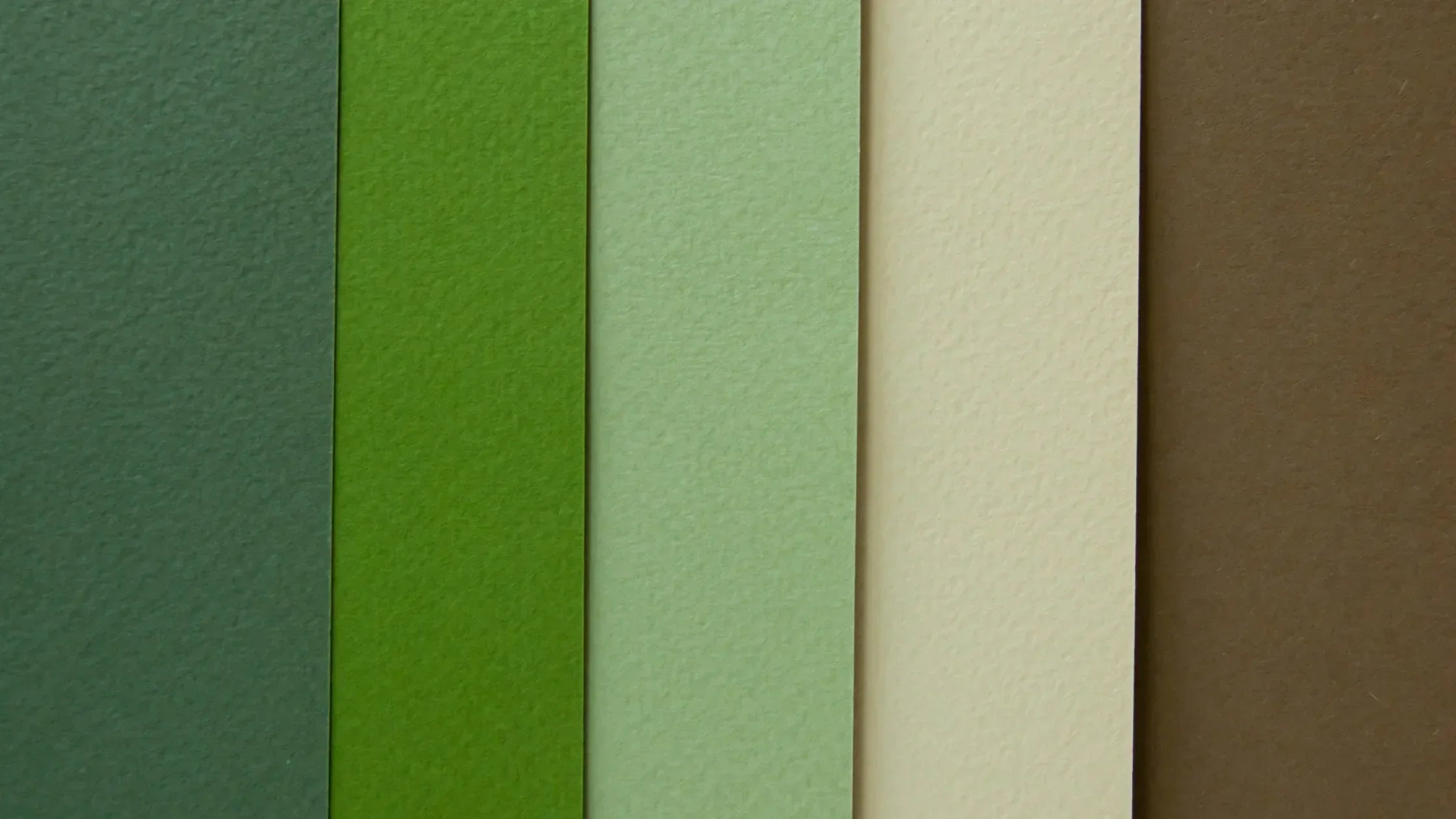
A Few Classic Colors to Know
You don’t need a huge palette to get this right. A handful of well-chosen shades can completely transform a space.
- Sakura pink – soft, dusty, and never overly sweet
- Matcha green – calm, grounded, and slightly earthy
- Indigo blue – deep and rich, but still relaxed
- Chestnut brown – warm and comforting
- Soft off-white – creamy, not stark
- Muted violet – subtle and a little unexpected
These tones show up a lot in traditional textiles, ceramics, and handcrafted decor—exactly the kind of pieces you’ll find in boutique Japanese home goods shops.

How to Use These Colors at Home (Without Overcomplicating It)
You don’t need to redesign your entire house. Small changes can go a long way.
Start with a neutral base
Soft whites, warm beiges, or light greys are perfect for walls or larger furniture pieces. This gives you a calm backdrop to build on.
Layer in natural materials
Wood, linen, ceramic, and paper instantly bring these palettes to life. A simple wooden tray or a linen table runner in a muted tone can shift the whole feel of a room.
Add color through objects, not walls
Instead of painting a wall bright green, try incorporating matcha tones through tea sets, vases, or cushions. It’s more flexible and feels more authentic.
Stick to a small palette
Three to five colors is usually enough. The magic is in how they work together, not how many you use.

Easy Palette Ideas You Can Try
If you’re not sure where to start, here are a few combinations that always work:
Soft Spring Feel
- Sakura pink
- Pale green
- Warm off-white
- Light grey
This works beautifully in bedrooms or quiet corners.
Earthy and Grounded
- Chestnut brown
- Moss green
- Beige
- Soft charcoal
Perfect for living rooms or spaces where you want to feel cozy but still refined.
Cool and Minimal
- Indigo blue
- Soft white
- Stone grey
- Dusty blue
Great for a clean, modern look that still feels warm.

Why This Style Works So Well for Boutique Home Goods
If you’re drawn to handcrafted, small-batch, or artisan Japanese decor, these palettes are basically made for that world.
Subtle colors let the craftsmanship shine. A handmade ceramic bowl, a woven basket, or a simple glazed vase stands out more when it’s not competing with loud colors around it.
It also makes your space feel more curated—like every piece was chosen on purpose (even if you picked it up on a whim).

A Few Styling Tips to Keep It Looking Effortless
-
Leave some empty space
Not every surface needs to be filled. Negative space is part of the aesthetic. -
Mix textures, not just colors
Smooth ceramics, rough wood, soft fabric—it adds depth without adding clutter. -
Avoid anything too glossy or synthetic-looking
Matte finishes and natural textures feel more in line with this style. -
Rotate with the seasons
Swap in lighter tones in spring, deeper tones in autumn. It keeps things feeling fresh without buying all new decor.

The Real Appeal: It Feels Calm (and Stays That Way)
The best part about subtle Japanese color palettes is that they don’t go out of style. Trends come and go, but soft, nature-inspired tones always feel relevant.
More importantly, they make your home feel like a place you actually want to spend time in. Not just something that looks good in photos, but something that feels good day to day.

Final Thoughts
You don’t need a full redesign or a huge budget to bring this look into your home. Start small. A few thoughtfully chosen pieces in the right colors can completely change the atmosphere.
If you’re already into boutique Japanese home goods, you’re probably closer than you think. It’s really just about letting those pieces breathe and supporting them with colors that feel just as calm and intentional.
Share:
Choosing the Right Wood Tones for a Japanese Interior
How to Mix Modern and Traditional Japanese Design